
Designing UX for AI features: A Guide for Product Managers
Why designing for AI is different & how to make AI features feel more trustworthy


Have you ever used an AI product and thought, “Why is it doing this?”
Maybe it gave a strange result. Or it felt way too confident in something totally wrong. Or worse—it gave you no option to say, “No thanks.”
When that happens, the problem usually isn’t the AI. It’s the user experience. And guess what? As the PM, you own that UX.
In this post, I’ll walk you through why designing for AI is different, how to make AI features feel more trustworthy, and the simple design rules that turn “weird” AI into wonderful AI.
AI is not always right—and that’s okay
AI is built on probabilities. It tries to guess the right answer based on past data.
But it doesn’t always get it right. It doesn’t know things the way rule-based systems do.
This means your AI feature might give:
A great answer
A good-enough guess
A totally off recommendation
And when it does, your design has to guide the user through that experience—without confusing or frustrating them.
Why AI features break UX expectations
Let’s compare:

That unpredictability is what makes AI both magical and risky. If your UX doesn’t handle it well, users lose trust.
Five Principles of Great AI UX
To design AI features that feel smart and human-centered, we need new principles.
1. Show the “Why”
People don’t trust what they don’t understand.
If your AI makes a decision, even a short explanation dramatically improves the user’s willingness to engage.
Bad UX:
“Here’s a trip you’ll love.”
Why? Who said I wanted this?
Good UX:
“We recommended this trip because you liked Maldives and this is trending for July.”
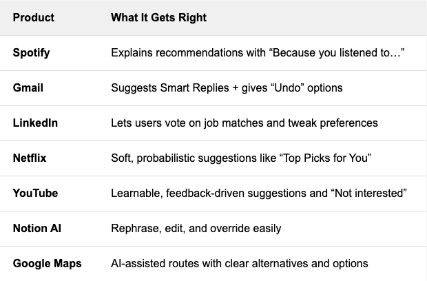
One line. Huge difference. Spotify nails this:“Because you listened to Coldplay…” This one sentence builds context, personal relevance, and trust. Google Photos does it too: “Rediscover this day from 2018.” Gmail’s Smart Reply goes further: It offers multiple, plausible suggestions—each short, safe, and easy to undo. Use simple explanation layers in your UI. If your AI model uses rules, weights, or past behaviors - summarize them in human language. Transparency is UX gold.
2. Always Offer a Way Out
Even if your model is highly accurate, no AI is right all the time. And when it’s wrong, don’t trap the user in a dead end.
Bad UX:
“These are your 5 options.”
No way to search. No way to skip. No way to disagree.
Good UX:
“Here are some suggestions—or browse all options.”
Always let users override the system. They will thank you—even if they never use it. Netflix uses soft nudges like “Because you watched…” but never blocks your freedom to explore. Google Maps suggests routes but gives you alternatives. Give people a graceful exit from the AI-driven path. A toggle, a “more like this” button, or a manual input option goes a long way.
3. Be Honest About Confidence
Nothing takes away trust faster than fake certainty. If your model is unsure—say so.
Bad UX:
“You’ll love this.”
Only to get it totally wrong.
Good UX:
“You might enjoy this.”
“Here’s a popular choice among similar travelers.”
Even visual cues help:
Add badges like “Beta” or “Experimental”
Group results as “Top Picks” vs. “Other Suggestions”
Build a “confidence design system.” Decide how to handle high, medium, and low-confidence predictions—and make that part of your UX library.
4. Learn from the User
Most AI models get better with feedback. But you only get that feedback if your UX invites it.
Simple ways to gather real-time learning signals:
👍 / 👎 buttons
“Was this helpful?”
“Why was this wrong?”
Undo or rollback actions
Rephrase or regenerate options
Gmail’s “Undo Send” is a trust multiplier—even though users rarely click it. YouTube lets you click “Not interested” or “Don’t recommend this channel.” So does instagram reels. Amazon asks “Was this answer helpful?” on product Q&As. Make it safe and easy for users to correct the AI. If possible, connect feedback loops to your ML retraining cycles—or at least log them for triage.
5. Make it feel human
Great AI UX doesn’t mean making it sound like a person. It means making it feel respectful.The best experiences aren’t flashy. They’re thoughtful.
Let’s recap what that feels like:
Suggest, don’t force
→ Let users choose their own pathExplain, don’t assume
→ Give rationale and room for disagreementListen, don’t ignore
→ Capture feedback, iterateAdmit when unsure
→ Show confidence, not arrogance
Duolingo uses its mascot (Duo the owl) to make mistakes feel fun, not frustrating. Notion AI offers multiple ways to edit, rephrase, or start over—respecting user agency.
Let’s recap the products that do this well:
These are small details, but they add up to trust.
What bad AI UX looks like
Here's what to avoid:
No reason for the suggestion: “Why am I seeing this?”
Too confident: “This is what you want”
No way to explore manually: “I can’t find what I actually want”
No feedback: “It feels like the AI doesn’t care what I think”
Even a basic feature, if designed with care, can beat a smart model with bad UX. If you're building something with AI, run it through this quick checklist:
Does it explain itself?
Can users override or explore more?
Does it show uncertainty when unsure?
Can it learn from feedback?
If yes to all 4—you’re on your way to a great AI experience.